My first time working with ShadCN (properly)
OK so for this one I needed to do something I've been doing quite a lot in old, legacy projects, using vanilla JS or jQuery, but this time I'm redoing it in a fresh stack. I've chosen React with Vite (TS goes without saying in 2025), Tanstack Query and Router, and TailwindCSS - no NextJS since this is a B2B app where there's no need for SSR or SEO really. On top of that I went with ShadCN because I've been hearing nothing but good things and apparently it integrates excellently with Tailwind.
My use case is a dashboard page with multiple card components, but the user might need only some of them on a given day. So the idea is that they are collapsed by default, with the user only opening (and fetching data for) the ones they need. AND the collapsing should be animated, of course.
I looked through the ShadCN components, and design-wise, the one that is closest to what I need is the Card component. Well the looks I can modify easily, I'm much more interested in the interactivity aspect... The Card is the closest, but it's not collapsible. There is actually a component called Collapsible, but it looks quite different from what I need... But what worried me the most is that the collapsing wasn't animated. My heart sank for a moment.
I've looked through a couple more but I don't think I had the time (or nerves) to test every single one. Luckily, another task in this project required the Accordion component, and when I did that, I was happy to see there was an animation there.
So now I wanted to see if I could take the method used for animating the Accordion component, and use it in my "Collapsible Card" component. Time to employ that "reverse engineering" I wrote about earlier...
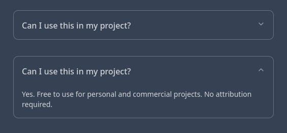
As a starting point, I chose the Collapsible component. Like I said, I can deal with looks no problem, and for interactivity it already had what I need - a trigger (the heading/title part, usually with an arrow near the right edge), and a body/content (which I'm hoping can be whatever I want):
1<Collapsible>2 <CollapsibleTrigger>Can I use this in my project?</CollapsibleTrigger>3 <CollapsibleContent>4 Yes. Free to use for personal and commercial projects. No attribution required.5 </CollapsibleContent>6</Collapsible>
Time to go under the hood and see what these are made of.
One of the first things that caught my eye while studying the collapsible.tsx code is a new kind of Tailwind class - data-[state=closed] or data-[state=open]. We're off to an excellent start. The library provides open/closed states already turned into Tailwind classes (no need for me to set up an isOpen state and use template strings to conditionally set Tailwind classes manually). This must be that "excellent Tailwind integration" I've been hearing about.
I can do a lot with that - turn the collapse arrow up and down, set up different trigger styles... I might need the trigger to have a bottom border when the card is open, or to have a different background color or something... So if it has a border-radius when it's closed, that border radius should only be on the top side of the trigger when it's open, and a flat bottom... Which here is easy, with: data-[state=closed]:rounded-sm and data-[state=open]:rounded-t-sm. The arrow icon is a child so it's a bit trickier, but luckily the Accordion showed me how that's done too: [&[data-state=open]>svg]:rotate-180.
I don't wanna get too bogged down by styling yet - my main problem here is the animation. Let's take another look at the Accordion component. I see it has custom classes like animate-accordion-up and animate-accordion-down. When inspecting them in dev tools, I see they animate the height from 0 to - get this - var(--radix-accordion-content-height). So they've actually thought of a way to "measure" the actual height of the content. OK, that's very good news and one less concern, but, that's an accordion-content-height, and I'm working with a collapsible...
Looking at ShadCN docs, I realize there is another hurdle - I'm doing this right after Tailwind 4 came out - and the ShadCN docs are still on Tailwind v3 and referring to things like a Tailwind config file, which has been dropped in version 4, so, not much help there... The Tailwind 4 docs, on the other hand, might be of more use - they tell me how to set up a custom animation class - define it inside the @theme directive, and define @keyframes the usual way. Easy enough, except remember - keyframes need both from and to... See where I'm going with this?
All my hopes right now are hinging on the possibility of there being a variable called var(--radix-collapsible-content-height), just like there was for accordion... If there isn't, I don't know what I'm gonna do.
So let's put it all together and see if it works... First, the css file:
1@theme {2 --animate-collapsible-up: collapsible-up var(--tw-duration, 0.2s) ease-out;3 --animate-collapsible-down: collapsible-down var(--tw-duration, 0.2s) ease-out;45 @keyframes collapsible-up {6 from {height: var(--radix-collapsible-content-height)}7 to {height: 0}8 }9 @keyframes collapsible-down {10 from {height: 0}11 to {height: var(--radix-collapsible-content-height)}12 }13}
Then, use data-[state=closed]:animate-collapsible-up and data-[state=open]:animate-collapsible-down on the <CollapsiblePrimitive.CollapsibleContent> and cross our fingers...
VOILA! It works! Thankfully, the ShadCN guys thought of everything :)
Now let's tie up a few more things...
One thing you may have noticed if you've worked with collapse animation, is that sometimes the animation is glitchy/jittery, not smooth. This goes back all the way to jQuery days, probably further... The thing is, if you put any size-altering css property on the element that's being animated (like padding in my case) - it will glitch. The fix is simple - wrap the children in a div that you can add padding to, while leaving only the animation-related css on the parent.
Sounds simple enough, but in this case, we might need to pass different content classes to different collapsible components, so we need to account for that and reorganize the props passed here a little differently. We'll extract the className separately so that we can apply them to the div wrapping the children, instead of the CollapsibleContent itself, and move the cn() function there in case other classes it receives can mess with the size. So finally, our CollapsibleContent component may look something like this:
1function CollapsibleContent({2 className,3 children,4 ...props5}: React.ComponentProps<typeof CollapsiblePrimitive.CollapsibleContent>) {6 return (7 <CollapsiblePrimitive.CollapsibleContent8 data-slot='collapsible-content'9 className='overflow-hidden data-[state=closed]:animate-collapsible-up data-[state=open]:animate-collapsible-down'10 {...props}11 >12 <div className={cn('py-3 px-4', className)}>{children}</div>13 </CollapsiblePrimitive.CollapsibleContent>14 );15}
Oh and have I mentioned I love how they are using the composition pattern so that I can wrap this around pretty much anything?
Here's another thing I love about this stack combo I've chosen, which I wasn't even thinking about when I started working on this:
On one hand, we have Tanstack Query which fetches data in a component when it's mounted.
On the other, we have a "collapsible card" that can take such component as a {children}, and has some useful option props - like defaultOpen. As you may guess, if you set it to defaultOpen={true}, the card will show up open and the data in the child will be fetched on "page load".
BUT, if you set it to defaultOpen={false}, the card is closed by default, and the children are not mounted - meaning the fetch doesn't happen until the user opens it! Which is perfect for my use case, with the user having many cards but only needing some.
I remember the work I needed to do back in the "old days" when, as the number of cards grew, I needed to move all the fetch calls from page load to onclick events, and manually setting up logic for open and closed states, and making sure the fetch only happens on the first "open" in case the trigger is clicked multiple times, and setting up local storage to remember the open states for each card, and making sure that's consistent across different pages (back when we had real page changes and reloads)...
But now - a simple switch - set defaultOpen to what you need, and Bob's your uncle, as they say in Australia... or was it England?